I've almost finished the "Just one sketch" course, but not quite.
I started off my masking off a sheet of paper, leaving a circle in the middle. In this circle I misted with glimmer mists, leaving a pearlescent sheen. I then inked it in a dark greenish, very lightly ;-) making it a bit darker round the edges, especially at one side to try & add depth.
I then dunked bubble wrap in the same ink & stamped it hard in a line (you can just about see it in this photo under & behind Zacks photo).
I cut the letters using circular nesties out of shiney iridescent paper, I also used them to cut the photos into circles. After everything was stuck down I added the journalling in brown pen.
I think it definitely conveys bubbles, lol, & though it doesnt look anything like my original page from my sketch it most certainly is based on my sketch.
Showing posts with label Just one sketch. Show all posts
Friday, 11 May 2012
Thursday, 15 March 2012
Just one sketch - No photos & layering
I REALLY enjoyed making this layout. A lot of my memories of "little Zack" (as opposed to his rather taller current self ) werent caught on camera as I didnt carry my film loaded camera around as much as I do my digi one so these are recorded without photos.
I altered my sketch slightly to make it suit more layers & the very pretty background sheet.
I am very happy how it turned out.
I altered my sketch slightly to make it suit more layers & the very pretty background sheet.
I am very happy how it turned out.
Tuesday, 6 March 2012
Just One Sketch - Minimise
I simplified my sketch, I only used 1 sheet of paper, some letter stickers & didnt even use any embellishments but opted to sketching.
The journalling reads....
"Zack will do anything to get out of tidying his room, especially putting his clothes away.
This includes sleeping under & over a big pile of clean clothes."
I like how this page has turned out, its a style I've never tried before, & the first time I've sketched anything onto a scrapbook page.
The journalling reads....
"Zack will do anything to get out of tidying his room, especially putting his clothes away.
This includes sleeping under & over a big pile of clean clothes."
I like how this page has turned out, its a style I've never tried before, & the first time I've sketched anything onto a scrapbook page.
Monday, 23 January 2012
Just one sketch - The sketch!
Thank you to all who commented yesterday, it seems I also like to use blue a lot, who knew!! (well Nicky & Jem did obviously ;-) I think this may be because it's such an easy stereotypically boy colour.
Heres the sketch I came up with.....
You can see the horizontal line, the strong placement of the title, journalling & the photo. The layering of the stars, which could be paper, embellishments or a mixture of the 2. The layering of paper over the background creates a border effect. I shall keep in mind textures, pale background & blue.
So heres the first page I created from it....
Can you believe I didnt have any banana related craft stock!!! Thank goodness for fimo ... not sure how it'll last, especially on the "peeled" bananas but we shall see.
I started off looking for a yellow that would go with the banana in the image, but all my stock seemed to clash, then I found the sheet I used for the back ground (Alla-Prima collection "Aquarella"), and decided to match up the other colours with this instead as the pattern on the majority of the page seemed quite internal-banana-ish. As it happens I couldnt match the mustard/brownish yellows tones up, grrrr! so I inked over a fawn coloured sheet instead.
The ribbon matched the teal plants perfectly, and it all seemed to go very well with the photo, making the banana yellow really stand out. I finished off with the yellow title, the journalling done in brown, and finally the little doodle of the banana as I felt the space here made the page look unbalanced.
Heres the sketch I came up with.....
You can see the horizontal line, the strong placement of the title, journalling & the photo. The layering of the stars, which could be paper, embellishments or a mixture of the 2. The layering of paper over the background creates a border effect. I shall keep in mind textures, pale background & blue.
So heres the first page I created from it....
Can you believe I didnt have any banana related craft stock!!! Thank goodness for fimo ... not sure how it'll last, especially on the "peeled" bananas but we shall see.
I started off looking for a yellow that would go with the banana in the image, but all my stock seemed to clash, then I found the sheet I used for the back ground (Alla-Prima collection "Aquarella"), and decided to match up the other colours with this instead as the pattern on the majority of the page seemed quite internal-banana-ish. As it happens I couldnt match the mustard/brownish yellows tones up, grrrr! so I inked over a fawn coloured sheet instead.
The ribbon matched the teal plants perfectly, and it all seemed to go very well with the photo, making the banana yellow really stand out. I finished off with the yellow title, the journalling done in brown, and finally the little doodle of the banana as I felt the space here made the page look unbalanced.
Sunday, 22 January 2012
Just one sketch
I've dedicated this weekend to following Miss Smiths prompts from Just on Sketch.
So I have initially looked at my favourite pages....
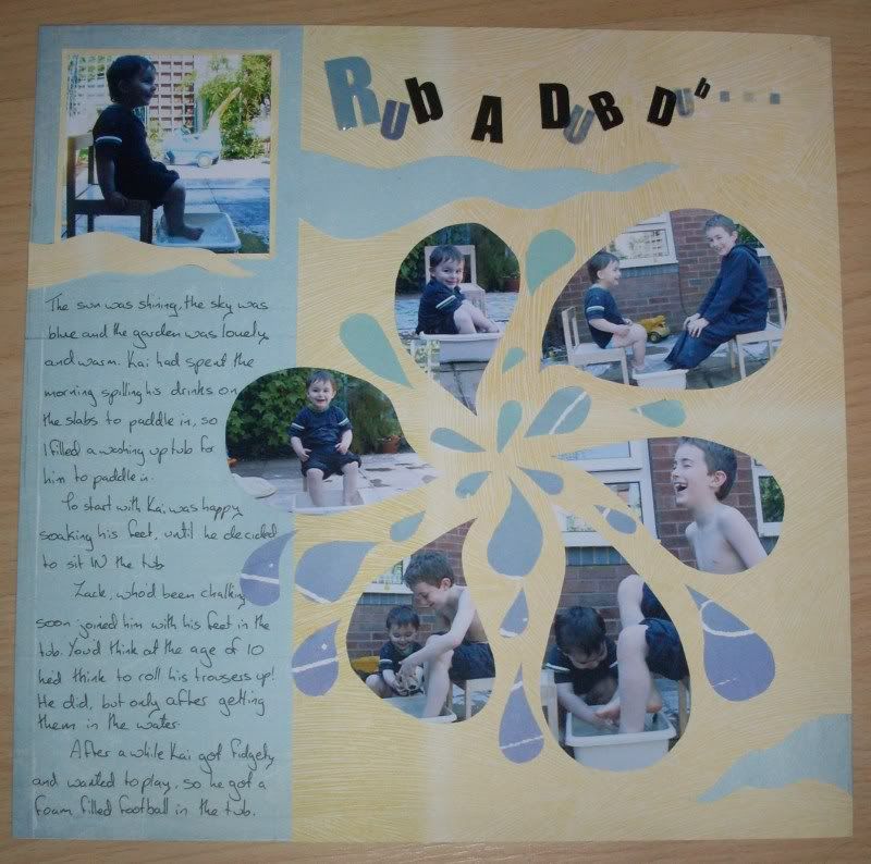
On this page I like the pale background (ooo, maybe a theme here!), the left strip for the writing, and the movement in the splash. I like how theres plenty of space to write my journalling & its just as important as the photos
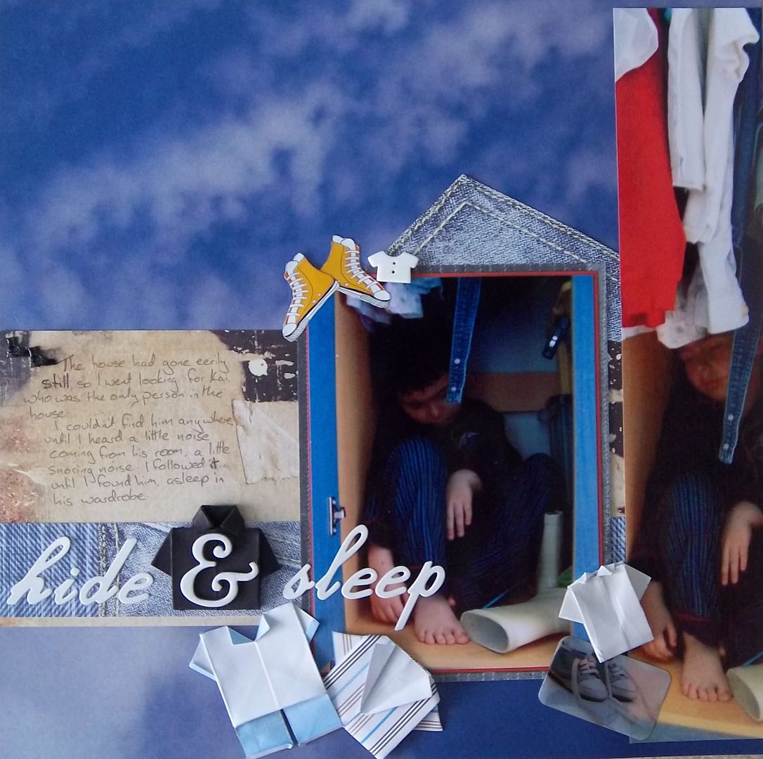
On this page I yet again like how the title & journalling are as important, if not more than the rest of the page. I like the 3dness of the shirts, buttons etc & I like the layering. I like the initial straight lines which are then blurred slightly by the embellishments.
So, in summary, the things that usually make me like my pages style are.....
So I have initially looked at my favourite pages....
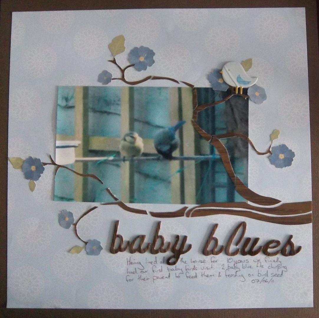
| Baby Blues |
| I like the simplicity of this page, the central photo with the space around it. I also like the pale back ground making the other colours stand out, and the border around the edge. I like how the title & journalling are as important if not more than important as the photo. |
| Rub a dub dub |
| Memory |
| In this one I like the layers, and how the white words make a border (I seem to like borders then) |
| Kaidy |
| We have another pale background here & I like the horizontal lines. The story is yet again given as much significance on the page as the photos. |
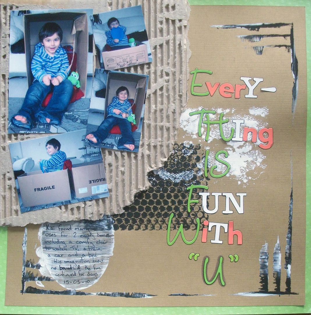
| Every thing is fun with "U" |
| I like the texture on this page, the layering up on images, paint, letters etc. |
| Hide & sleep |
So, in summary, the things that usually make me like my pages style are.....
- Pale background sheets
- Borders
- straights axis (predominantly horizontal)
- a space for both journalling & title that make them clear and stand out.
- texture & 3d
- layers
Join me tomorrow as I look at making a sketch encompassing these ideas; until then, can you spot any other similarities in these layouts?
Subscribe to:
Posts (Atom)