Showing posts with label Creativity Blog Camp. Show all posts

Friday, 6 August 2010

Ivory

The first Creativity Boot Camp prompt was Ivory, this made me think of my Moms wedding dress. I had printed out a photo of my Mom & Dad last year & hadnt got round to using it but it was perfect for this prompt.

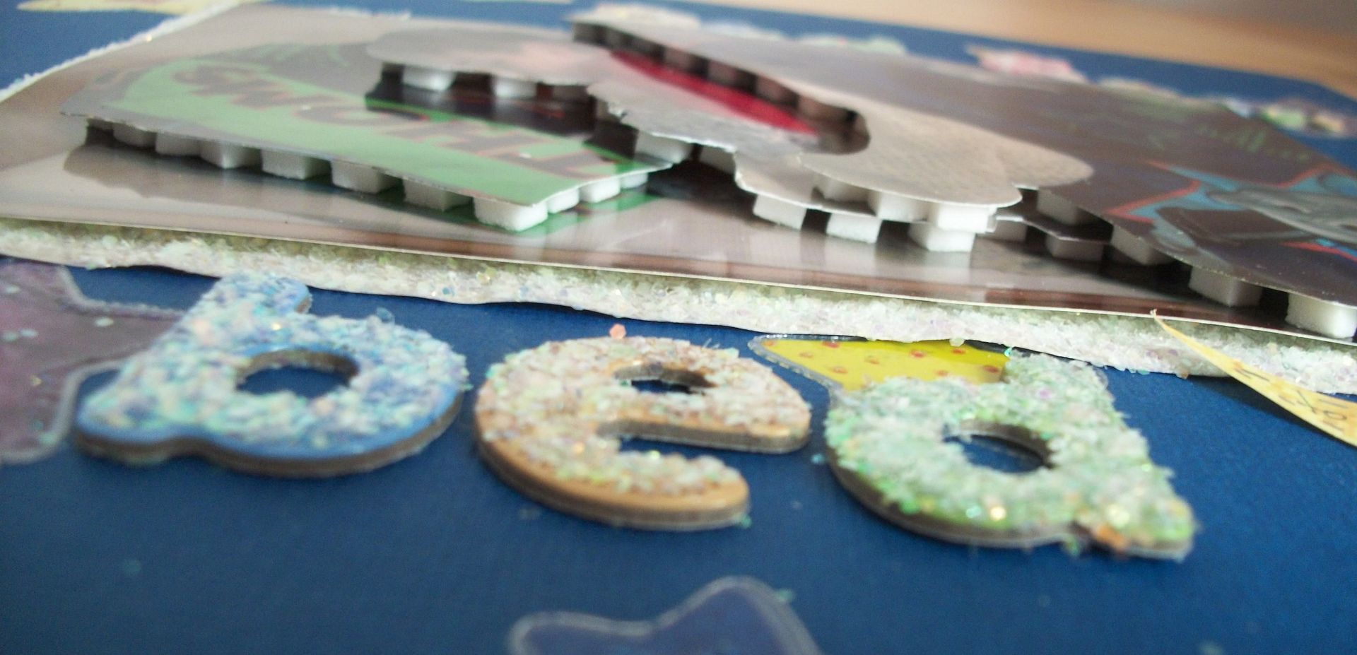
I added chipboard onto & behind the photo to make it look like it was on an easle or similar.

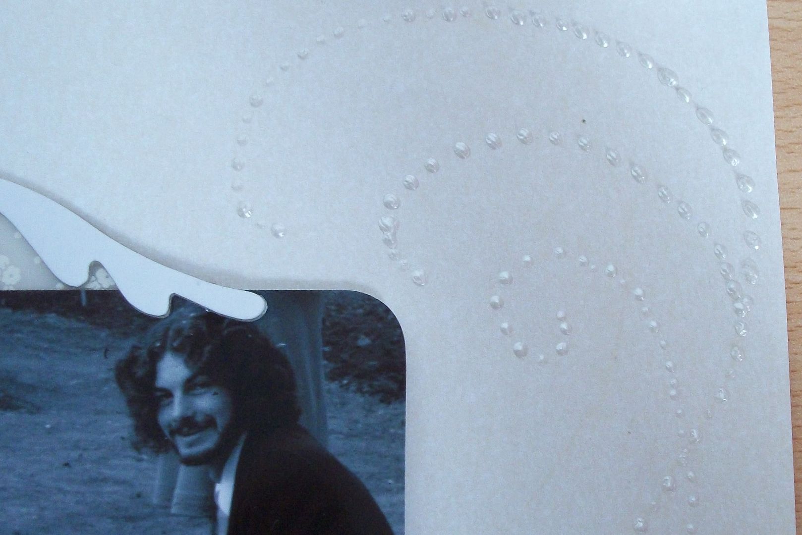
I then added swirls onto the background sheet with a pearl coloured 3d fabric paint (I find this gives a great 3d effect). I also used this on some white thickers spelling out "Newly weds" to give them an extra sheen

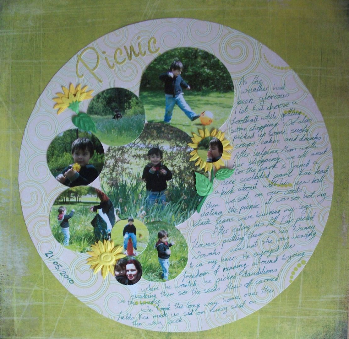
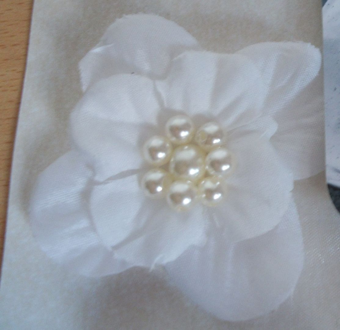
I took apart some fake white flowers, relayered them and added fake pearls from a bracelet in the centre, then attched them on to the sheet.
Having then stuck the photo on using foam pads to raise it I wanted to add some journalling so I took a thickers chipboard white frame & stick some vellum on the back. I wrote my journalling on it & then put foam pads behind the frame so I could stick it down without it showing through the vellum.


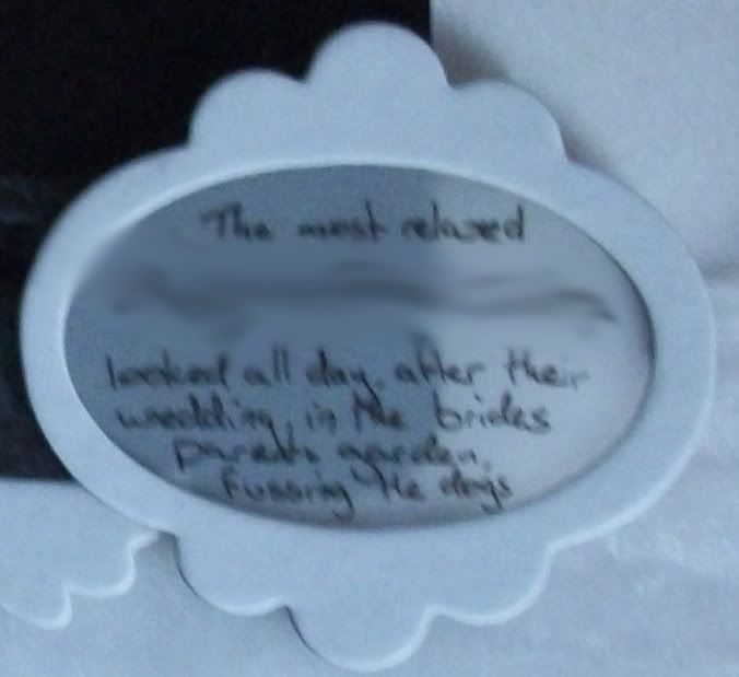
I think the monochrome effect of the page really makes the photo stand out.

Thursday, 22 July 2010

Doodle page

One of the prompts from Creativity Boot Camp was "Heavy Metal", in this house we probably listen to quite a bit of music that would be classed as heavy metal, though I have to admit, there are so many different names for rock, metal emo & everything else I have no idea what is classed as what these days.

Looking through my photos I came across the photos of Ryan & Kai on Guitar Hero (Kai cant play as hes too small but he does enjoy pretending to)

I also came across the Rusty Pickle Popstar sheet called "Zac" (so Zack is there in spirit if not in the photos) & decided it was perfect.

I set about with my promarkers to colour in the doodles on this sheet. I would like to learn how to doodle like this as I am not much of a doodler & want to doodle on a pair of sandles I got the other day (watch this space). I also highlighted certain words & parts of the pattern with Glossy Accents.
I played around with the photos but found them a bit too "square" to go with the background so I cut Kai out & stuck him down like that.

To make the picture of Ryan fit in more I stuck it down & then copied the pattern over the edges of the picture a little.
I finished off by adding a little bit of journalling on the provided lines in red so it would fit in. With the keywords in the sentence I altered my handwriting so it was a bit more "Doodlish".

It was a fairly simple page to do thanks to the paper I used but I thorougly enjoyed doing it.

Thursday, 8 July 2010

& so to bed

One of the creativity blog camp prompts was layers. I immediately thought of 3d decoupage but wasnt sure how to use it on a scrapbook layout, then it hit me I could layer up a photo.

While cutting it out I wasnt too sure if it would work & didnt actually like it until I had totally finished it.

I layered the picture up with foam pads & then matted it onto a piece of card I'd covered in glitter. I also covered the chipboard letters I jad with glitter as well. The background paper is bazzil which I covered in star stickers before attaching the photo. Finally I cut out a star & did my journalling on it and went round the edge with a ruler & silver pen to bring it all in.

Saturday, 19 June 2010

CBC - Picnic

I've been working along to the Creativity Blog Camp at my own pace and enjoying it immensly, getting photos on layouts that might have sat there for ages to come, as well as trying out new techniques. Here is from day 2's prompt word "Picnic"

I started by playing with the size of the photos, those I felt most important are the largest & going down in size in relevance of importance. I then printed them out, cut into circles and played with their positioning. I ended up putting them almost in chronological order so they'd tell the story.

I chose Gypsy - Migration to mount them on due to all its swirls and hints of green that went with all the greenery in the photos. All by itself this looked wrong so I cut it out into a circle and backed it onto Basic Grey - Urban Prairie - hay loft. I also used some basic grey letters to spell the title and then wrote in green pen the journalling in the space down the side of the photos, I tried to make my writing in a looped fashion to reflect all the circles.

It still didnt look look right so I dived into my embellishements and found some embossed sunflowers. I removed the brown centres and ended up with flowers that resembled the dandelion Kai has picked in one of the photos.

Linkwithin

Related Posts Plugin for WordPress, Blogger...