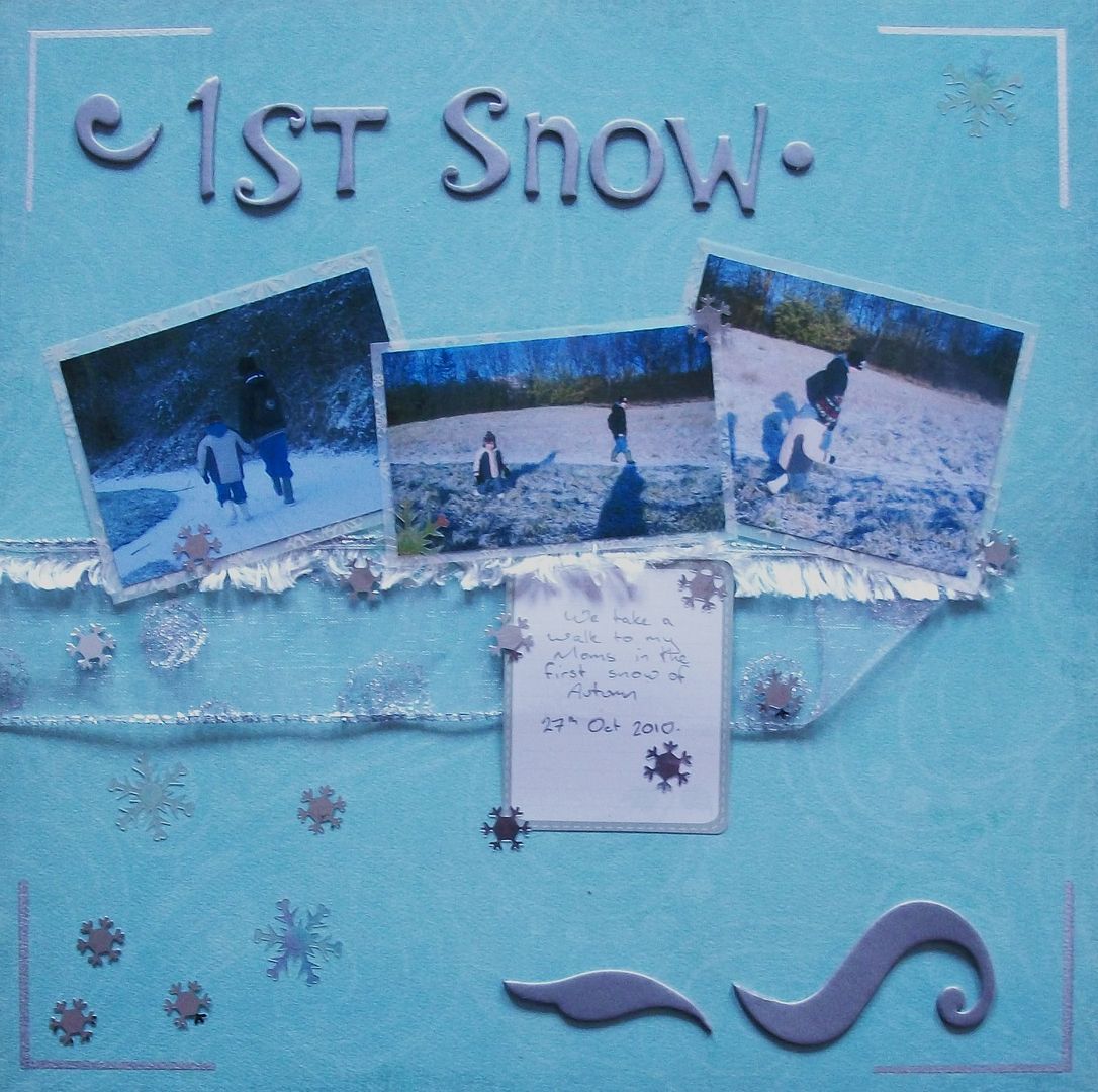
If I was to do this page again I would most certainly move the photos and ribbon down so the photos would take my attention more, & balance the page out more, but we live & learn :)
I kept to whites and silvers to give a frosty feel, and added the thicker shapes to give a feeling of movement & cold.


I love the layout - it's gorgeous just the way it is!
ReplyDelete