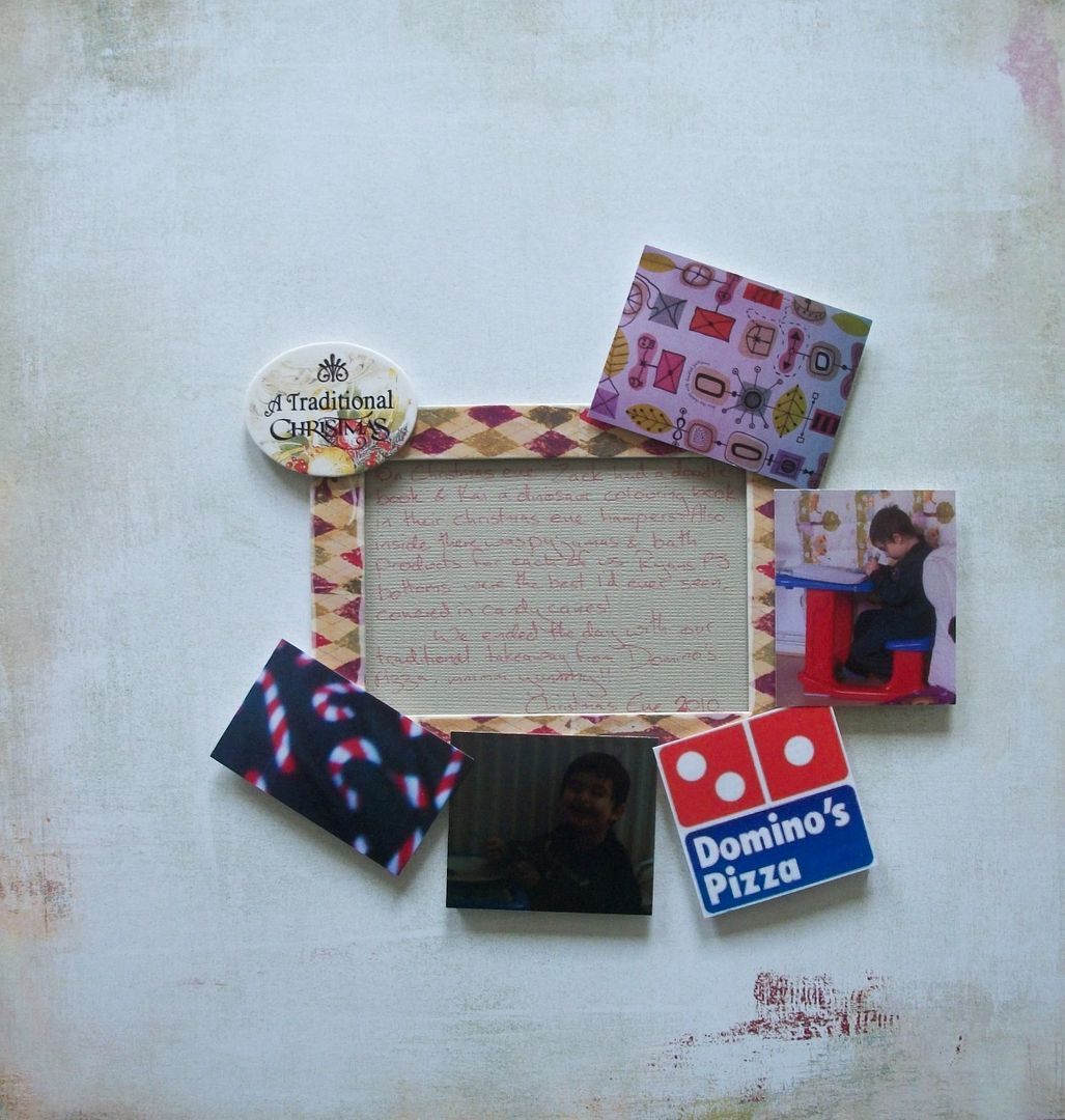
This page evolved from an idea that was totally different, I knew I wanted the photos laid out in a higgledy piggledy way, in a group, maybe in a circle, but I had originally envisaged lots of layers, cut out shapes, stockings etc.
I looked through my scrappy borders etc to find something to make the journalling stand out a bit from the rest so came across this frame, & then the oval "title" that went so nicely together, christmassy yet not in your face christmassy. While flicking through the 12x12s I came across this sheet & thought it would be a nice plain background to layer up on, & found a 6x6 that went with the colours & did my journalling,
I noticed that all the colours were kinda working at this stage, but the journalling & frame were too big to have away from the photos so I decided to put the photos around the frame.With a little bit of jiggling they fell into place. I looked at the page, ready to start thinking of shapes, images etc for the backgound ........and stopped. The page worked as it was, it just worked. No need for anymore adding to it.
Zack looked at it later on & said it was weird how no matter how he looked at it that his eyes were always drawn to the images & writing, & that it was my best page yet - compliment indeed from the 12 year old who not only works on the straight forward "It looks nice" but also on "Its aesthetically pleasing & works on many other levels due to...."


No comments:
Post a Comment