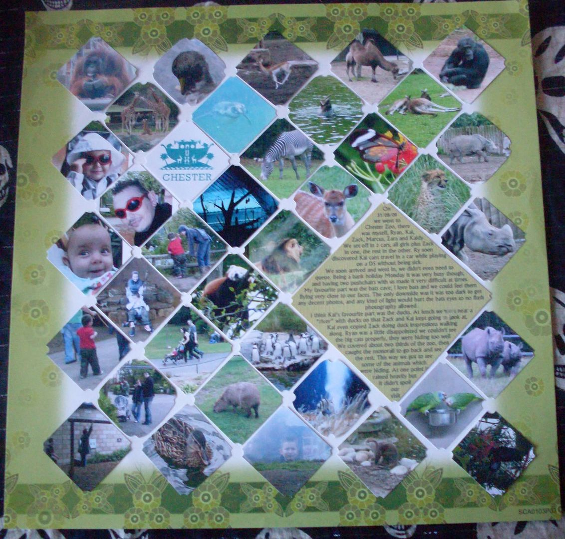
 I tried to use the photos to make the look of the wire fences they use at the Zoo, if I was to do it again I wouldnt cut the top of the photos, I'd leave them pointed. It was simple to do, work out the size of the photos & therefore how many I could fit, rotate 45degrees in photoshop, crop to a square, alter the size to the size I needed and print. Cut out, and use a hole punch ( I used my crop-o-dile) to punch a semi circle on each corner.
Do similar with the box for writing.
I find it helps to layout the photos in publisher first, gives me an idea of the final layout.
This is my favourite layout so far, I think its simple but effective, no embellishments, or added items, just the photos, journalling and backing paper.

I love this one too! It does look like wire! Are they brads in between each photo? must have taken some patience to round all of those corners!
ReplyDeleteO good, I hope it would but an finicky, lol. Nope, just the corners punched off :)
ReplyDeleteIt's amazing!
ReplyDeleteWow I love this it looks great x
ReplyDelete